Step 1: Fill the Excel Sheet with Your Data & Assign the Right Data Types
The first step is to actually fill the data you need with an Excel spreadsheet. If you have imported this data from another application, it is likely to be compiled into a .csv (comma-separated values) formatted document. If this is the case, create an Excel file using an online CSV to Excel converter or open it in Excel and save the file with an Excel extension. You will still need to clean up the rows and columns after converting the file. Working with a clean spreadsheet is easier so that the Excel graph you construct is simple and quick to edit or alter.
If that doesn't work, you might also need to enter or copy and paste the data manually into the spreadsheet before generating the Excel graph.
Excel has two components to its spreadsheets:
- The rows that are horizontal and marked with numbers
- The columns that are vertical and marked with alphabets
Make sure you visit the Number section under the Home tab after all the data values have been set and accounted for, and allocate the correct data form to the different columns. If you do not do this, chances are that your graphs are not going to show up correctly.
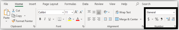
For example, if column B measures time, make sure you select the time option from the drop-down menu and assign it to column B.
Step 2: Choose the Type of Excel Graph You Want to Create
[g_article_ads]
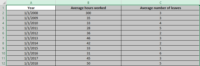
This would depend on the type of information you have and the number of different parameters that you are simultaneously monitoring. Line graphs are your best choice if you're trying to take note of patterns over time. Let's say that we track the average number of working hours/week/employee and the average number of leaves/employee/year against the duration of fourteen years.
Step 3: Highlight The Data Sets That You Want To Use
You need to select the various data parameters for a graph to be generated. Place your cursor over the cell labeled A to do this. You'll see it turn into a tiny arrow that points downwards. Click on cell A when this occurs, and the entire column will be picked. Repeat with columns B and C, press the Ctrl (Control) button on Windows, or use the Mac Command key.
Your final selection should look something like this:
Step 4: Create the Basic Excel Graph
[g_article_ads]
Visit the Insert tab with the columns selected and choose the 2D Line Graph option. Below your data values, you can instantly see a graph emerging.
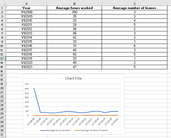
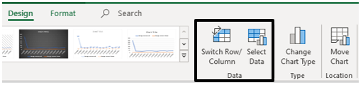
Often, in the first stage, if you do not allocate the correct data form to your columns, the graph may not display the way you want it to. Excel may, for instance, plot the Average Number of Leaves/Employee/Year parameter along the X-axis instead of the Year. In this case, under the Design tab of Chart Tools, you can use the Switch Row/Column option to play around with different X-axis and Y-axis parameter combinations until you find the perfect rendition.
Step 5: Improve Your Excel Graph with the Chart Tools
Go to Chart Tools in the Excel header to change colors or to change the design of your graph. From the design, the layout, and the format, you can choose. Each one will change your Excel graph's look and feel.
Design: Design lets you shift and re-position your graph. It allows you the right to modify the form of a chart. You can also experiment with various chart layouts. This can adhere more to the guidelines of your brand, your personal style, or the preference of your manager.

Layout: This helps you to change the axis title, the chart title, and the legend's location. You could go along the Y-axis with vertical text and along the X-axis with horizontal text. The grid lines can also be modified. To enhance the look and feel of your graph, you have every formatting tool possible at your fingertips.
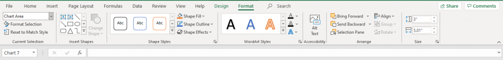
Format: The Format tab allows you to add a border around the graph with the width and color you want so that it is properly separated from the data points that are filled in the rows and columns.
And you've got it there. An accurate visual representation of the information you have manually imported or entered to help the team members and stakeholders better interact with the data and use it to build plans or to be more aware of all the constraints when making decisions!
[g_article_ads]
Challenges with Making a Graph in Excel
You can construct a graph fairly quickly when manipulating simple data sets. But when you start inserting several parameter data types into many data types, then there will be glitches. Here are some of the challenges you'll have:
- Data sorting can be problematic when creating graphs. In order to make your "graphs" look more aesthetically pleasing, online tutorials might suggest data sorting. But be vigilant when the X-axis is a parameter dependent on time! Sorting data values by magnitude will mess up the graph's flow because the dates are randomly sorted. You may not be able to identify the patterns very well.
- You may forget to remove duplicates. If you have imported the data from a third-party application, this is particularly true. Generally, redundancies are not filtered by this form of data. And if duplicates sneak into your pictorial representation of trends, you could end up corrupting the credibility of your knowledge. It is better to use the Remove Duplicates option in your rows when dealing with extensive volumes of data.
Data Visualization Tips
You now know how to make Excel graphs. It is not, however, the end of the story. Data visualization is not merely piling together multiple graphs but is concerned with the ability to convincingly communicate the right message from the data to the reader. Here are some tips that will allow you to take your information visualization abilities to a new level:
Keep it simple
In data visualization, "Keep it simple" remains the golden rule. Always try to make it as easy as possible with your graphs or charts. Mind that the message that your chart aims to communicate quickly should be understandable by a reader.
Choose the right graph
Know the main differences between different kinds of graphs, such as bars, lines, etc. Learn about each form of graph's benefits and drawbacks. In your case, this simple knowledge will ensure that you select the most suitable form of a graph.
Pick the right colors
In data visualization, a color is an important tool. Choosing the right colors for a chart or graph will help your readers easily understand the main pieces of data. If you choose the correct colors for a graph, note that the distinctions between data points cannot be transmitted by two similar colors, whereas excessively contrasting colors, as well as too many colors, can confuse a reader.
Properly label data
For efficient data visualization, data labeling is key. For starters, marking the axes of your graph and main data categories is always a good idea. Be mindful, however, that unnecessary labeling on your graph will distract your readers.
Don’t use special effects
Unless required, don't use special effects (e.g., 3D). For instance, because a bar graph considers only two dimensions, a 3D function on a bar graph is not required. Special effects on a graph can only distort proportions, and it is easy to confuse a reader.
It doesn't have to be overly complicated to create graphs in Excel, but there can be some simpler resources to help you do it, just like making Gantt charts in Excel. Instead, check out project management software if you are trying to build graphs for workloads, budget allocations, or tracking projects. Many of those functions are automatic and without the entry of manual data. And you are not going to be left wondering who has the new data sets. Most solutions for project management have built-in file sharing and some visualization capabilities.
Check out this video to get a better understanding on creating a step by step graph in excel.
Creating a graph is a simple task when you know how to do it. For those who find it difficult this article will help you out. Let us know if you have more tips and easier methods to create graphs in excel. Also do not forget to share your thoughts about this article!
Author of Get Basic Idea – Knowledge Base.